HTML
요소 배치
haventmetyou
2023. 10. 19. 17:33
절대 위치를 사용한 요소 배치
자손의 position 속성에 absolute 키워드를 적용하려면 부모에 height 속성을 입력
<head>
    <title>Absolute Position</title>
    <style>
        #container {
            width: 500px; height: 300px;
            border: 3px solid black;
            overflow: hidden;
            position: relative;
        }
        .circle {
            position: absolute;
            width: 100px; height: 100px;
            border-radius: 50% 50%;
        }
        #red {
            background: red;
            left: 20px; top: 20px;
        }
        #green {
            background: green;
            right: 20px; top: 20px;
        }
        #blue {
            background: blue;
            right: 20px; bottom: 20px;
        }
        #yellow {
            background: yellow;
            left: 20px; bottom: 20px;
        }
    </style>
</head>
<body>
    <h1>Dommy Text</h1>
    <div id="container">
        <div id="red" class="circle"></div>
        <div id="green" class="circle"></div>
        <div id="blue" class="circle"></div>
        <div id="yellow" class="circle"></div>
    </div>
    <h1>Dommy Text</h1>
</body>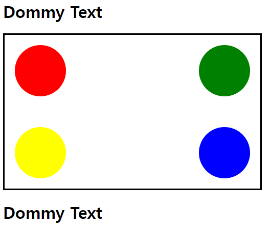
        .circle {
            position: absolute;
            width: 100px; height: 100px;
            border-radius: 40% 40%;
        }
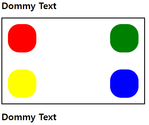
border-radius 숫자 줄이면 덜 동그란 원 만들 수 있음
    <style>
        #container {
            width: 500px; height: 300px;
            border: 3px solid black;
            overflow: hidden;
            position: relative;
        }
        .circle {
            position: absolute;
            width: 100px; height: 100px;
            border-radius: 20% 20%;
        }
        #red {
            background: red;
            left: 20px; top: 20px;
            margin-left: 20px;
        }
        #green {
            background: green;
            right: 20px; top: 20px;
            margin-top: 20px;
        }
        #blue {
            background: blue;
            right: 20px; bottom: 20px;
        }
        #yellow {
            background: yellow;
            left: 20px; bottom: 20px;
        }
    </style>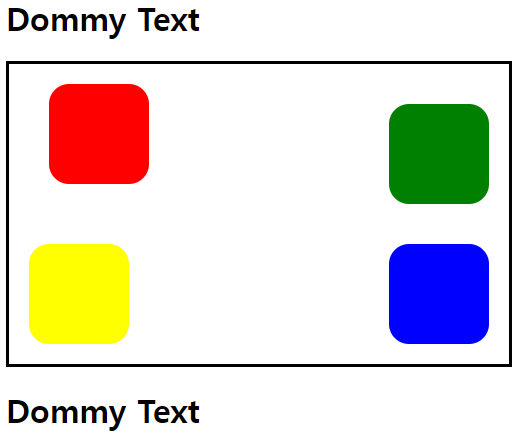
위 기능 이용해 CSS로 오륜기 만들기
<!DOCTYPE html>
<html>
<head>
    <title>Absolute Position</title>
    <style>
        #container {
            width: 500px; height: 300px;
            border: 3px solid black;
            overflow: hidden;
            position: relative;
        }


        #blue {
            left: 80px; top: 60px;
            position: absolute;
            width: 100px; height: 100px;
            border-radius: 50% 50%;
            border: 7px blue solid;

        }
        #red {
            right: 70px; top: 60px;
            position: absolute;
            width: 100px; height: 100px;
            border-radius: 50% 50%;
            border: 7px red solid;

        }
        #green {
            right: 130px; bottom: 60px;
            position: absolute;
            width: 100px; height: 100px;
            border-radius: 50% 50%;
            border: 7px green solid;
        }
        #yellow {
            left: 140px; bottom: 60px;
            position: absolute;
            width: 100px; height: 100px;
            border-radius: 50% 50%;
            border: 7px yellow solid;
        }
        #black {
            left: 198px; top: 60px;
            position: absolute;
            width: 100px; height: 100px;
            border-radius: 50% 50%;
            border: 7px black solid;

        }
    </style>
</head>
<body>
    <div id="container">
        <div id="red"></div>
        <div id="green"></div>
        <div id="blue"></div>
        <div id="yellow"></div>
        <div id="black"></div>
    </div>
</body>
</html>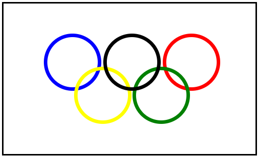
요소 중앙 배치
<!DOCTYPE html>
<html>
<head>
    <title>Absolute Position</title>
    <style>
        /* 초기화 */
        * {margin: 0; padding: 0;}

        /* 주제 */
        body {background: red;}

        #container {
            /* 색상 및 크기 적용 */
            width: 500px; height: 250px;
            background: orange;

            /* 위치 설정*/
            position: absolute;
            left: 50%; top: 50%;
            margin-left: -250px; margin-top: -125px;
        }
    </style>
</head>
<body>
    <div id="container">
        <h1>요소의 중앙 배치</h1>
    </div>
</body>
</html>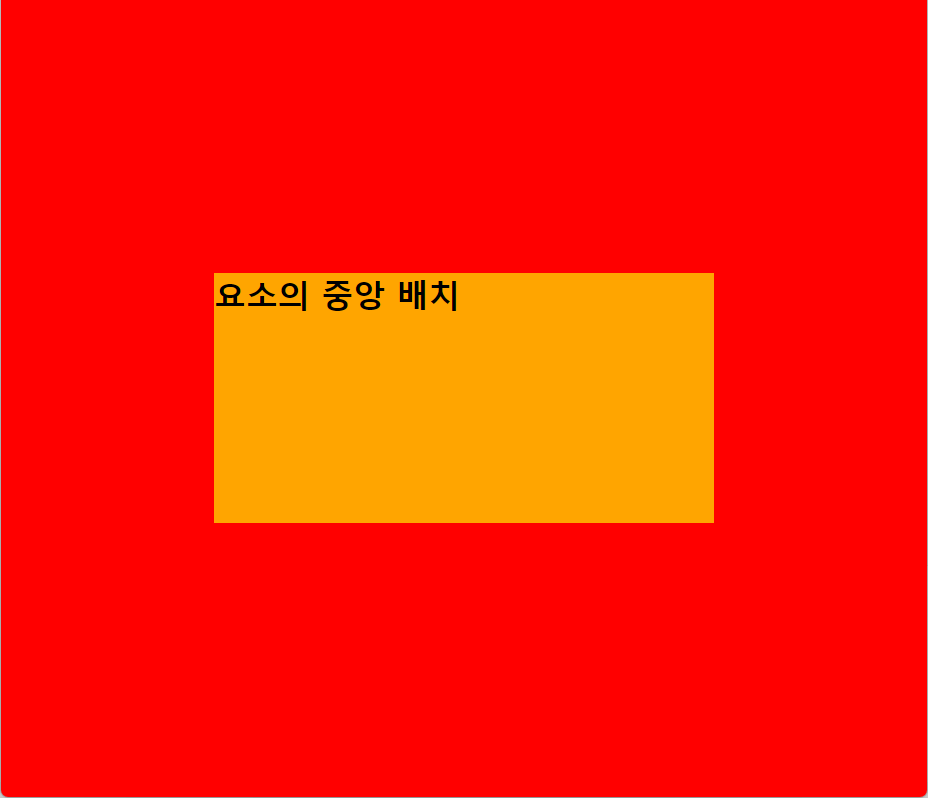
요소를 고정 위치에 배치
고정 바 배치
<head>
    <title>Fixed Bar</title>
    <style>
        .container {
            margin-top: 50px; margin-left: 50px;
        }
        .top_bar {
            background: red;
            position: fixed;
            left: 0; top: 0; right: 0;
            height: 50px;
        }
        .left_bar {
            background: blue;
            position: fixed;
            left: 0; top: 50px; bottom: 0;
            width: 50px;
        }
    </style>
</head>
<body>
    <div class="top_bar"></div>
    <div class="left_bar"></div>
    <div class="container">
        <p>Lorem ipsum dolor sit amet, consectetur adipisicing elit.</p>
        <p>Lorem ipsum dolor sit amet consectetur adipisicing elit. </p>
        <p>Lorem ipsum dolor sit amet, consectetur adipisicing elit.</p>
        <p>Lorem ipsum dolor sit amet consectetur adipisicing elit. </p>
    </div>
</body>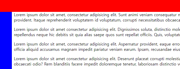
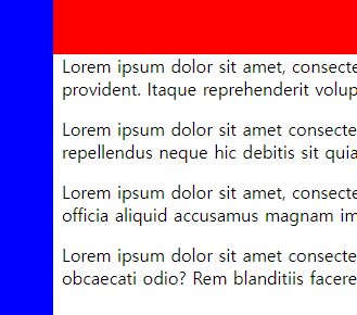
파란색 고정 바 윗부분이 끝까지 덮게 하기
        .left_bar {
            background: blue;
            position: fixed;
            left: 0; top: 0; bottom: 0;
            width: 50px;
        }
left_bar 안 top 위치를 0으로 수정
고정 바는 스크롤을 내려도 움직이지 않고 고정되어 있음
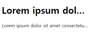
글자 생략
<head>
    <title>Ellipsis</title>
    <style>
        h1, p {width: 300px;}

        .ellipsis {
            white-space: nowrap;
            overflow: hidden;
            text-overflow: ellipsis;
        }
    </style>
</head>
<body>
    <h1 class="ellipsis">Lorem ipsum dolor sit amet, consectetur </h1>
    <p class="ellipsis">Lorem ipsum dolor sit amet consectetur adipisicing elit.</p>
</body>